
What is Mobile First Design?
Mobile-first design is a design philosophy that focuses on building websites and applications that work well on the latest devices that have less screen space than a laptop or traditional desktop computer.
A website will usually be created on a desktop PC, or sometimes on a laptop. A laptop or desktop computer typically has a large screen on which to view all of the content. However, most of your visitors will visit from a mobile which has a significantly smaller amount of screen “real estate” to play with.
A mobile-first design will look great to users on a smaller screen as well as a larger one.
Why is Mobile First Design Important?
Mobile-first design is important because of the increase in smartphones and tablets, which have drastically changed how people access the internet. Instead of using desktop or laptop computers, more people are accessing the internet through their mobile devices.
Mobile-first design makes good sense as mobile devices are growing in numbers, with more than half of all internet users accessing their site from a mobile device. This number is even higher in developed nations, where 4 and 5G internet speeds make accessing the internet on-the-go not only feasible, but often a better experience.
Google uses Mobile First to Rank Sites
Everyone knows that ranking highly on Google is vital to get your business discovered by new customers and build your brand authority.
Google will index new websites using the mobile version by default. So it definitely pays to make sure your mobile site is well optimised. An exception to this is if you have a completely separate mobile and desktop website: Google will show the mobile site to mobile searchers and the desktop site to desktop searchers.
This technique is not used too often in 2022, as most users prefer to have the same content delivered on a mobile or a desktop computer. So for the majority of people, you need to set up your website for mobile responsiveness.
A lazy “hack” around this is to not display content on a mobile. This is easily achievable using the CSS property display: none alongside a media query. But be warned: this isn’t the method you’ll want to use too often.
Google only uses the content from your mobile site for indexing, so if you leave out important information from the mobile site (as many people do because “it doesn’t work well on mobile,”) then you risk not having it indexed by Google. This will hit the amount of traffic you can expect to drive to your site.
To avoid having your site penalised by Google, you need to spend the time making sure that your entire site is mobile friendly, or find a web developer who can do this for you.
Does a Website Automatically Scale to a Mobile Size?
A website is a bunch of code put together by a person. It won’t automatically do anything that it isn’t told to do. A browser needs to be told how to display the information on the website. This is done by coding. Your website will not automatically know how to respond to a small screen unless it has been told how to do it by your website’s code.
Whilst some WordPress themes may be able to resize to different display sizes, they will nearly always need some tweaking through code to ensure that they look great across all device sizes.
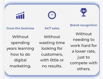
Usually, this will mean that items stack on top of one another and the font or images scale in size. Take a look at this section from my homepage:

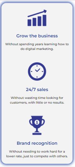
On this image, I have set each icon and its text to take up 33% of the available space. On a desktop computer, this looks fine. However, without any additional coding, the images will still take up 33% of a smaller screen. This looks odd on a mobile phone, as you can see below:
On a much smaller 390 pixel screen, the size of an iPhone 12 Pro, it looks bad and will put viewers off from using the site.
Using mobile first design principles, this area should perform well on a mobile, so it needs to be changed. Instead, it makes more sense for each image and text section to take up most of the screen’s width. This will result in a much nicer design and a better user experience for mobile visitors.
With a small amount of CSS code, we can tell the browser to stack these sections on top of one another, and take up extra width on the screen.
What are the Benefits of Mobile First Design?
The benefits of mobile first design are that all users of your site get a great experience. Your page will work and be accessible to users regardless of which device they choose to visit from.
Your site will load quicker because there will be fewer items to display. This is an important Google ranking factor, not to mention that 50% of users will abandon your site if it hasn’t loaded within 3 seconds. If visitors don’t have a great mobile data signal when they visit, having a less congested layout could be very benificial.
Mobile visitors tend to have shorter attention spans than their large screen counterparts. If you include too much content and force the visitor to scroll through a lot of content, they may leave the site before they reach the desired location. Your conversions and then profits will suffer.
Is Mobile First More Complicated?
In a nutshell, yes. Creating websites today is more difficult than it was even 10 years ago, when most visitors browsed the internet from standard sized screens on laptops or desktops.
There are ways to make the process less difficult, such as:
- Don’t overuse complicated items or animated objects
- Use images that scale well across all device types. Images with a central focus work well, because the edges are cropped out as the screen width reduces. A central focus will display the parts you want on a mobile
- Make it clear which objects should be clicked (or tapped). People won’t be able to “hover” over an item on a touch screen like they can with a mouse. Look at my examples above: they have a mouse or finger icon, and an instruction that the box will give more info
- Use plenty of subheadings. Mobile readers will get bored of long paragraphs if they aren’t separated with clear subheadings.
Summary
As you can see, mobile first is a concept adopted by Google and that makes it incredibly important for anyone with an online presence.
A website created by G10 Digital will look great across all device sizes as they are robustly tested against all of the most common screen sizes. In other words, your visitors can use any device and your website won’t let you down!
Contact me today to find out how I can create you a great looking website…on mobiles and PCs.